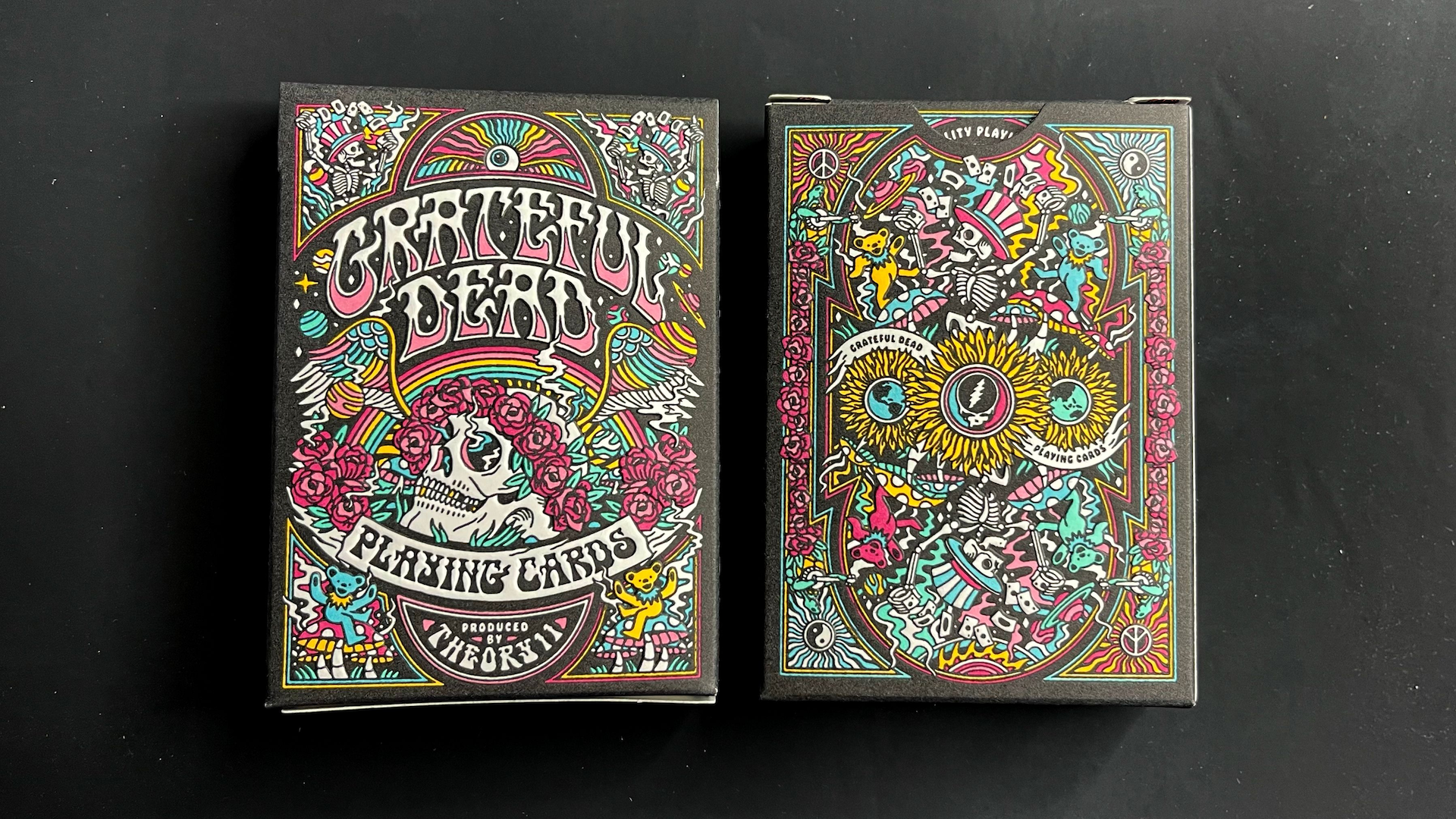
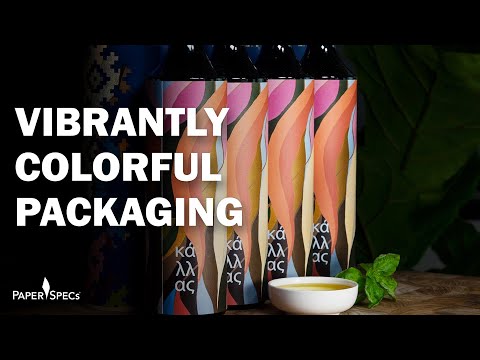
From dancing bears to flower-wreathed skulls, few bands are as well known for their intricate artwork and trippy color palettes as ‘60s psychedelic legends The Grateful Dead. So when playing card powerhouse Theory11 wanted to release a deck in honor of the group, color and intricacy were bound to play a big role in their packaging. What artist Joshua Noom came up with is bound to impress Deadheads the world over.
The icing on the cake for you and me as designers and print lovers? The ultra-vibrant tuck box was letterpress printed by our friends at Studio On Fire [projects / website] …using 6 colors! If your jaw hasn’t hit the floor yet, remember that when it comes to letterpress printing, each color requires a separate trip through the press, which is why most letterpress pieces max out at 2 or 3 colors.
First, each time you send your paper through the press it stretches the sheet, so the stock you use must be able to handle that kind of wear. In this case, they used the sustainable – and oh-so-appropriate – Mohawk Renewal Hemp Smooth Fiber White [PaperSpecs PRO members: Get Your Free Swatchbook here, and Promotion Piece here.] Even more challenging is getting 6 different colors on a letterpress piece this intricate to line up perfectly on a stock that’s being stretched through repeated printings.
This is definitely one of those pieces where the closer, and longer, you look at it, the more you see. Sure, there are the usual skulls and skeletons you’d expect, including the Red and Blue “Steal Your Face” icon you’ve probably seen a hundred times throughout your life on car bumpers and windows, and the aforementioned “dancing bears.”
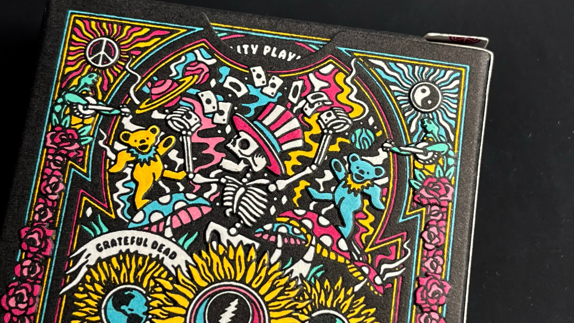
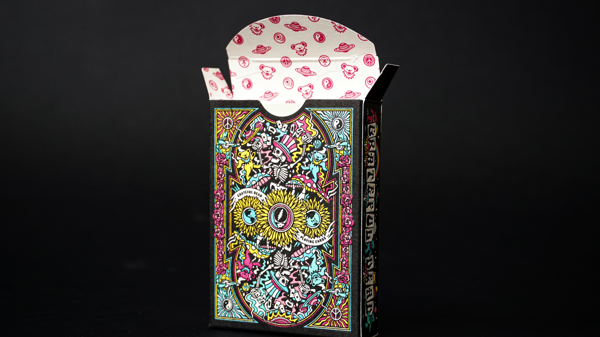
Soon, though, other images emerge, including banjo playing turtles, roses by the dozen, peace signs and planets. And each relies on their respective colors to line up precisely. Even the inside of the box is imprinted with a series of Dead-themed icons in 1 color.
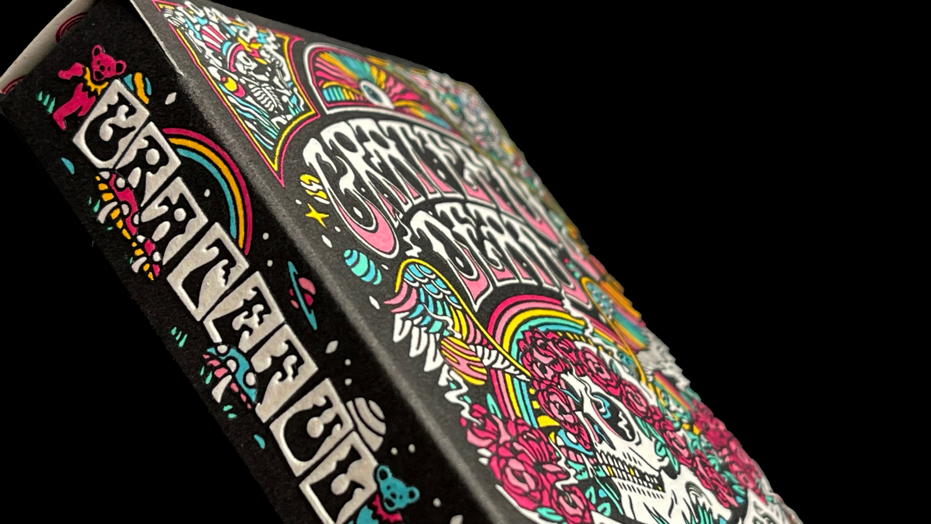
Maintaining this level of tight registration requires a great deal of experience on the part of the printer, as well as an artist’s eye for detail. When people call Studio On Fire the crème de la crème of letterpress printers, this is a colorful example of what they mean. And if all of this wasn’t enough, parts of this colorful artwork are even further enhanced with a registered emboss, too, adding that extra finger-pleasing tactile experience!
All of which goes to show that if you can imagine it and design it – no matter how intricate it may be – there are printers out there that can make sure your final product isn’t Dead on arrival. And for that, we are all Grateful 😉


